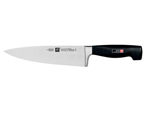
I LOVE I love my knife. It's not a particularly fancy knife, as far as chef's knives go, but it is high quality. Cheap, stamped knives don't hold an edge well and make cutting a chore. High-end Japanese knives cut like butter, but don't stand up to abuse. My knife stays sharp, and survives every trip to the utensils drawer my absentminded roommate subjects it to.
My knife fits perfectly in my hand. In my hands, my knife has cleaned a deer, cooked dinner for 30, and prepped a lot of chili ingredients. But my knife never feels better in my hands than when I am dicing an onion.
I HATE
Hate is probably too strong of a word, but I strongly dislike the UX of Google Maps on iOS. It is frustrating and feels condescending--I am not stupid, please don't treat me like I am.
This is most apparent while driving. There's nothing like inputting a destination, putting on Spotify and then being interrupted a couple minutes into my drive with, "You are on the fastest route!" I mean yeah, no shit, that's the whole reason I am using Google Maps, what else would I be on? This continues as I am driving: "There is a 5 min slowdown ahead, you are still on the fastest route." WHY ARE YOU INTERRUPTING MY MUSIC TO TELL ME THIS USELESS INFORMATION!?
By far the worst "feature", though, is the auto-zoom to the driving route. Before some engineer/designer mucked this up back in 2016, you could pinch to zoom out and see more of your route. I really like to do this when I'm somewhere unfamiliar so I know the general direction I'm headed and can anticipate lane changes/turns. Now, though, I'm stuck with one super zoomed-in view of the route, or a super high level overview of the whole map (unusable on a trip longer than 10 minutes). Try to pinch to zoom out but accidentally touch anywhere on the actual route itself? BOOM, auto-zooms all the way back in--WHY? I wish I had the email address of the person who designed this so I could send them hate mail. My girlfriend is tired of listening to me yell at my phone in the car.
